Colour grading in Lightroom - vs Photoshop
So just how good is colour grading in Lightroom? Especially when comparing it to the more professional colour grading in Photoshop technique. In this tutorial, you’ll learn how to colour grade photography in Lightroom and we’ll also put this technique head to head by doing the same in Photoshop.
Let’s learn Lightroom’s colour grading pannel and see the differences in grading the same image in Photoshop. The results are quite surprising!
Get access to ALL our online courses - 1000’s of videos, worksheets, critiques of members work, personalised support and much more with our monthly membership.
What is colour grading?
Colour grading in photography is the process of changing or enhancing the colours of an image. It’s used in photography and in film making to change the mood or enhance a feeling the photographer is trying to portray. It’s also used to make an image more aesthetic by choosing a harmonious colour scheme and applying this to your image.
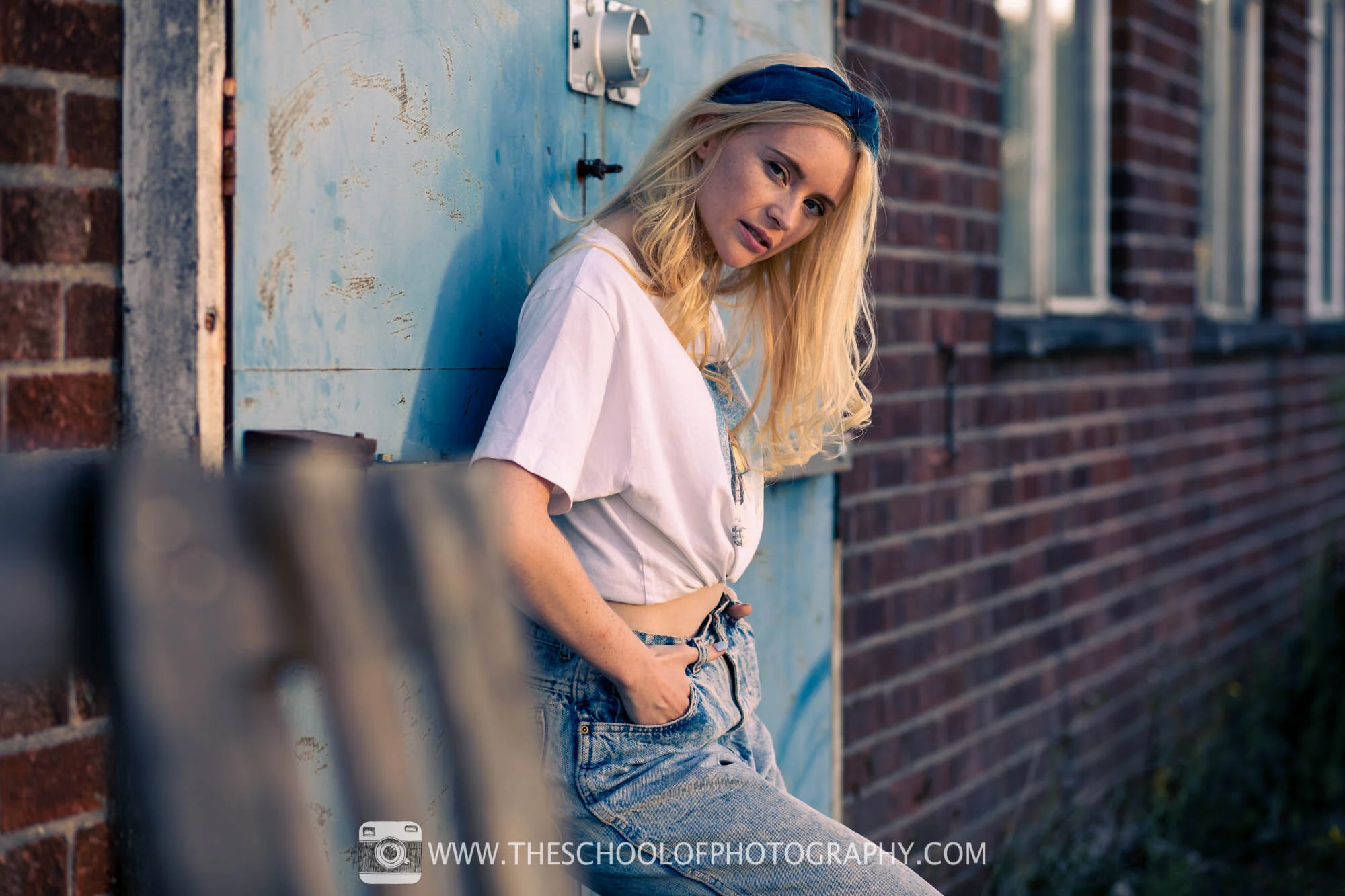
In our example, we use the common complementary colour scheme using oranges and blues. This is sometimes referred to as the orange and teal look. As you can see in the image below, blues have been added to the shadows and oranges have been added to highlights to help harmonise with the colours already present in the image. This makes it much more pleasing to the eye.
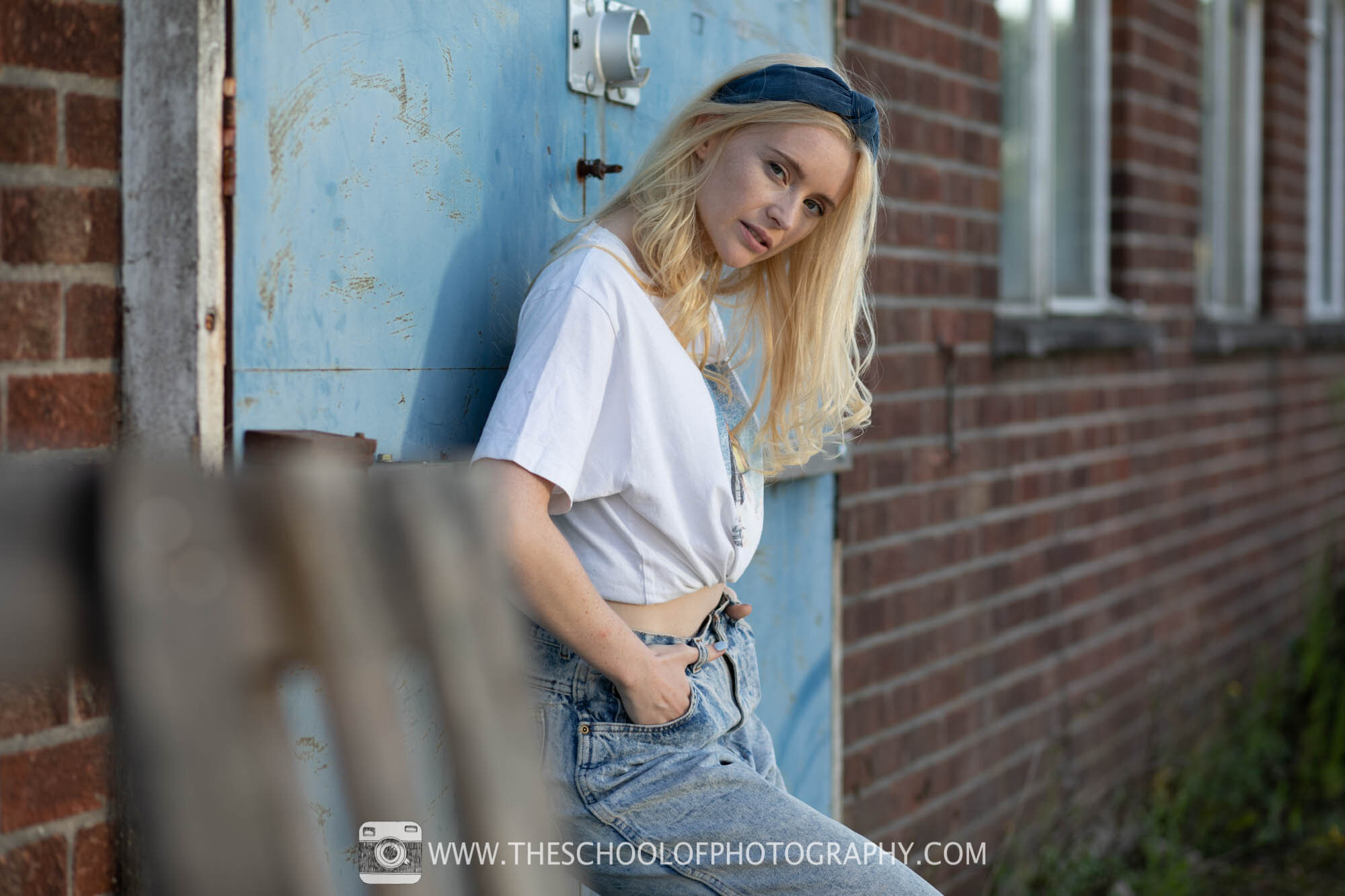
Raw image straight out of camera - Camera Settings: F 2.8 - 1/400th Second - ISO 100 - 85mm Focal length

Colour graded in Lightroom
Colour Grading in Lightroom
Lightroom has added a specific colour grading panel to help you add colour to your photography. In the panel, you find 3 colour wheels which represent your highlights, mid-tones and shadows. Using these wheels, you can add colour to your highlights, mid-tones and shadows respectively.
You can control the saturation of a colour by clicking, holding and moving out of or into the centre of the colour wheel. To change the hue of the colour simply move the dot around the wheel to colour you want.
Once you’ve chosen your initial colours you can use the Blending slider to set the degree of overlap between shadows and highlights and you can use the Balance slider to balance the effect between your highlights, mid-tones and shadows. E.g. add more colour into your highlights whilst reducing it from your shadows or visa versa. There is also a luminance slider that will brighten or darken the effect.
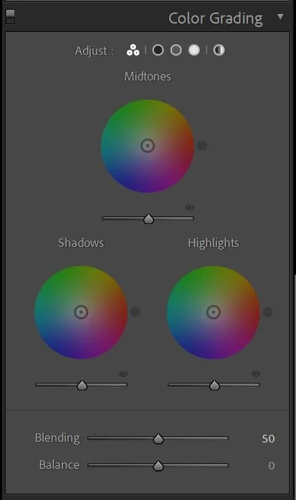
Colour Grading Panel in Lightroom

Colour Grading wheel in Lightroom
How to Colour Grade your photography in Lightroom
The best way to colour grade in lightroom is to think of a colour scheme you would like to achieve before you start. Inspiration for this usually comes from the colours already in the picture. Then think about colours that harmonise with those colours and look for colours that clash with it.
For instance, if your photograph is a sunset with orange light flowing over your scene, then orange would be a good colour to base your colour scheme around. Once you’ve got this think about what colours harmonise or complement this colour and what colours will clash.
In the example below orange light is hitting the peak of the mountain so using the colour grading panel in Lightroom I have added oranges into the highlights and mid-tones and reds into the shadows. This has brought the colours in the image together and given a much more harmonious feel.

Mount Teide, Tenerife - Raw image, not colour graded - Camera Settings: F 11 - 1/13th Second - ISO 100 - 35mm Focal length

Mount Teide, Tenerife - Colour graded in Lightroom
You don’t have to and shouldn’t limit yourself to just Lightroom’s Colour Grading panel. There are many other tools in Lightroom to help you grade the image. As mentioned before, it’s not just about adding colours. You should also be removing colours that clash with your scheme. In the Mount Teide example above, greens started to appear in the bottom right of the image whilst processing. To remove these, I used the HSL panel and desaturated the greens.
I also used the Presence sliders to increase vibrance in the blues and the saturation across the whole picture. Below are screenshots of the exact settings used to colour grade this image.
To learn how to use Lightroom properly, click here.
Photoshop or Lightroom for Colour Grading?
In the video above I compare the same image colour graded in Lightroom and Photoshop, so, here is my verdict.
The colour-grading panel in Lightroom is a good, very good, and I think it will serve its purpose for most people. I also think it will find its niche in Landscape photography more than portraits as there are usually less refinements to do in landscapes. It is also very easy to use!
However, this brings me onto my next finding, Lightroom colour grading lacks refinements. It lacks the fine detail you can add when doing it Photoshop. Photoshop gives you options to target more specific colours across your scene and mask off these effects with precision detail if needed. Having said that though, colour grading in Photoshop is much more complex.
So, if you want a quick, easy and somewhat effect approach to colour grading, Lightroom will do the job fine. If you want a more professional, refined look, particularly in portraiture, Photoshop is where to go.
Portrait picture colour graded in Lightroom - Camera Settings: F 2.8 - 1/400th Second - ISO 100 - 85mm Focal length

Portrait picture colour graded in Photoshop
Examples of Colour Grading

Raw image of Canary Wharf, London - Camera Settings: F 16 - 3.2 Seconds - ISO 100 - 16mm Focal length

Colour grading version using Lightroom

Raw image - Camera Settings: F 2.8 - 1/250th Second - ISO 800 - 85mm Focal length
Colour grading version using Lightroom
To learn how to colour grade photography in Lightroom and Photoshop properly, click here.
You may also be interested in our tutorial where we discuss how how AI is changing photography.
Get instant access to all our high-quality online courses.
Like this? - Check out similar tutorials below


I hope you liked this tutorial on colour grading, if you did please leave us a comment and support us by sharing it with your friends and subscribe to our newsletter at the bottom of this page for more.
We also have an excellent learning community on social media so please join us there as well.
Thanks for watching and remember – Learn more at The School of Photography.
